Stacked Area Charts: Clarity or Chaos?
The problem with unclear trends and a better way to use stacked area charts.
The Data Signal is a free newsletter for product & data analytics enthusiasts. Hit the nifty button below to subscribe and never miss a post!
There are a few things we’re certain about—they’re good and serve a purpose. Then, there are the other things we know for a fact to be rubbish or suboptimal. But the real problem arises with the things that sit in the grey zone: where you’re uncertain whether they’re useful or just plain bad.
Stacked area charts? They fall squarely in that last group. (And pie charts - in the rubbish group - obviously)
Recently, I came across a LinkedIn post from Data For India (I genuinely admire their work, by the way—this isn’t a dig at them). The post included a chart meant to illustrate how rural India’s water consumption has shifted—less reliance on wells, more on piped water:
But here’s the thing: the chart didn’t really offer the clarity it should have. It left questions hanging. What’s happening with handpumps or tube wells? Are they declining too, or are they stepping in to replace wells? Who’s actually taking up the “space” left by Wells - is that value constant or changing over the years?
Another issue with stacked area charts is the mental gymnastics required to interpret values for individual categories. For instance, in 2000, to determine the percentage for tube well, you’d need to subtract the lower value (~21%) from the higher value (~71%), giving you 50%. This extra cognitive load makes it harder for readers to quickly grasp the data, especially when dealing with multiple categories or subtle changes.
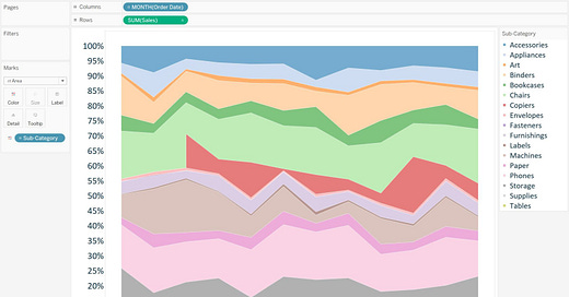
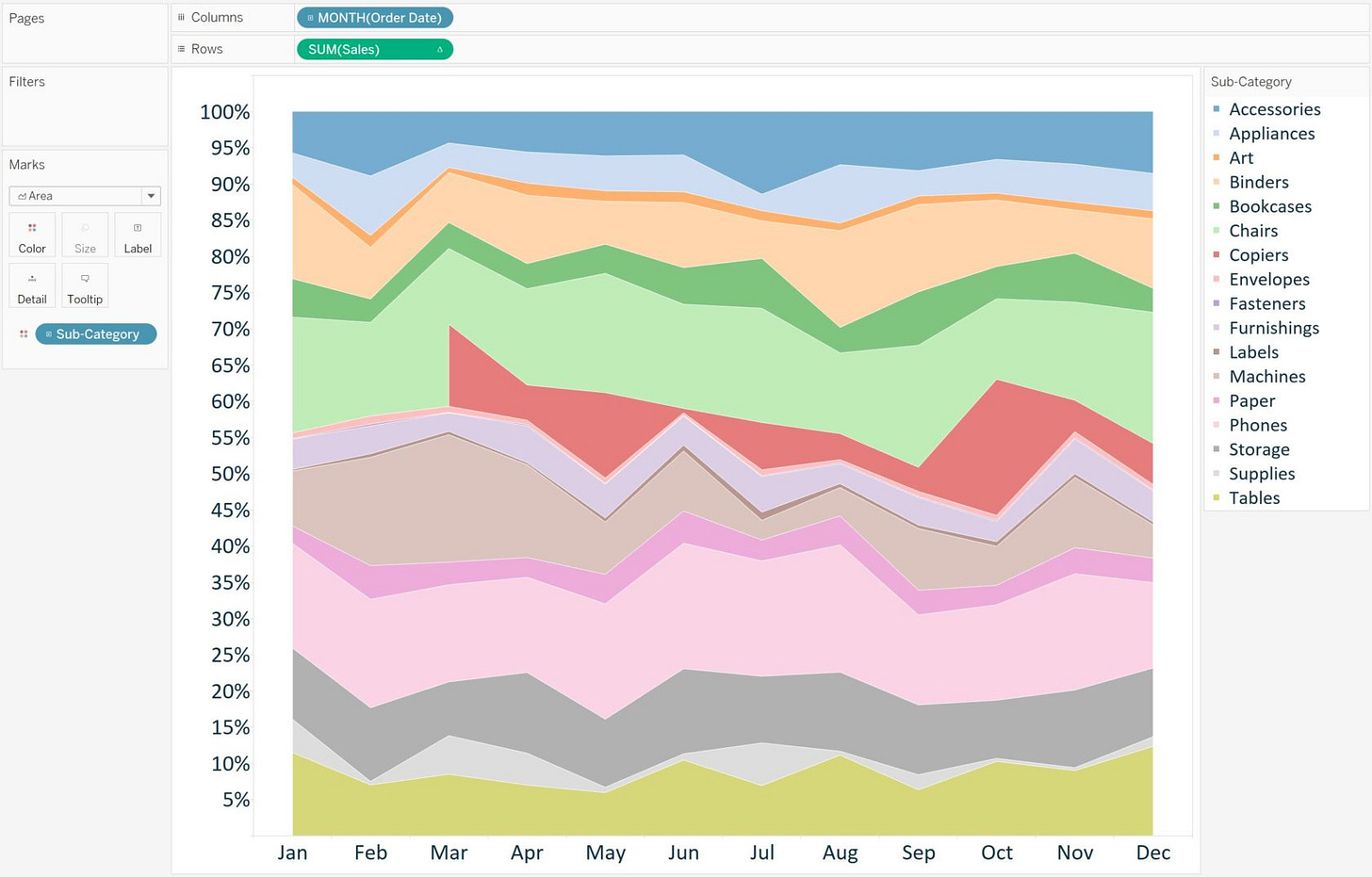
Now, imagine if the trends were less drastic and there were more categories to track. Something like this:
Trying to make sense of this would be a nightmare.
This brings me to an example of a better approach—one I saw in an INDMoney LinkedIn post. They used percentage-based stacked area plots but added labels like this:
Notice the difference? The labels make it far easier to track how each category has changed over time. Even minor changes, like Net Banking moving from 10% in 2018 to 13% in 2023, stand out clearly.
Personally, I might’ve gone a step further and added another label around 2020 or 2021. A mid-period snapshot would give a fuller sense of the progression.
What do you think about stacked area charts? Useful, rubbish, or firmly in that grey zone?
If this got you thinking, share it with someone who loves a good chart debate!


